the design archive
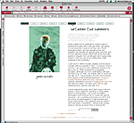
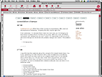
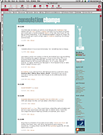
This is your chance to see the evolution/revolution/pollution of my web site. Click on the thumbnails to see a larger image (popup!)
| picture not available | between the hammers v.1.0 -- fall 97-fall 98 My first ever attempt at a web page had a black background, white serif text, and was liberally adorned with graphics of artists I love: Chagall, Dali, Klee, George Tooker. Not much to look at, sure, but nonetheless, it helped me in my pursuit of Brooke, who commented favourably back in 1997. If she only knew what she was getting into... |
 | between the hammers v.2.0 -- fall 98-spring 00 This was up from about the fall of 1998 to the spring of 2000. That's about 16 months too long. The font is called Horse and is/was from Robotic Attack Fonts, designed by John Martz. My non-proficiency with tables is clearly evident. |
 | between the hammers v.2.5 -- spring 00 My redesign included Javascript rollovers for the first time. I actually still like parts of this design, although I didn't really change much of the content on the site. I also added the Atomz search engine at this time. |
 | consolation champs v.1.0 -- spring 00-summer 00 This was the first version of my weblog, when it still resided as one page on my personal site (between the hammers). It soon outgrew the rest of the site. |
 | consolation champs v.2.0 -- summer 00-june 02 I began the blog officially on July 7, 2000 and registered the domain in September. This design has stood me in good stead, and I've tried to recreate it without tables using CSS when I transferred over 600 entries from Blogger to Movable Type. |